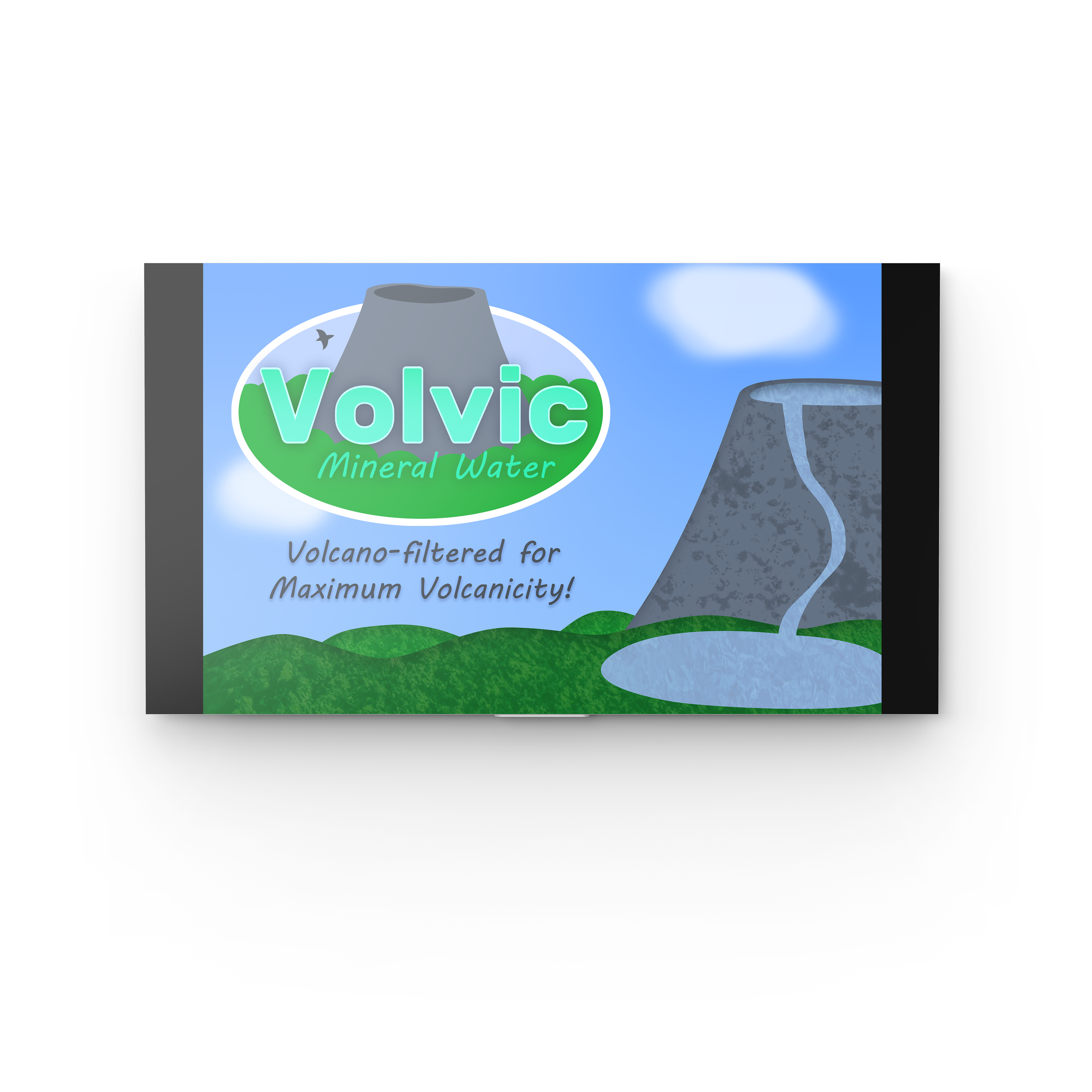
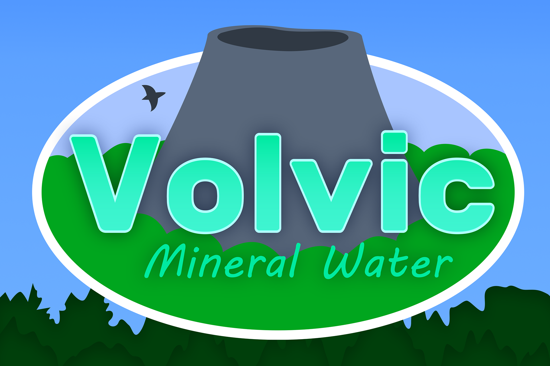
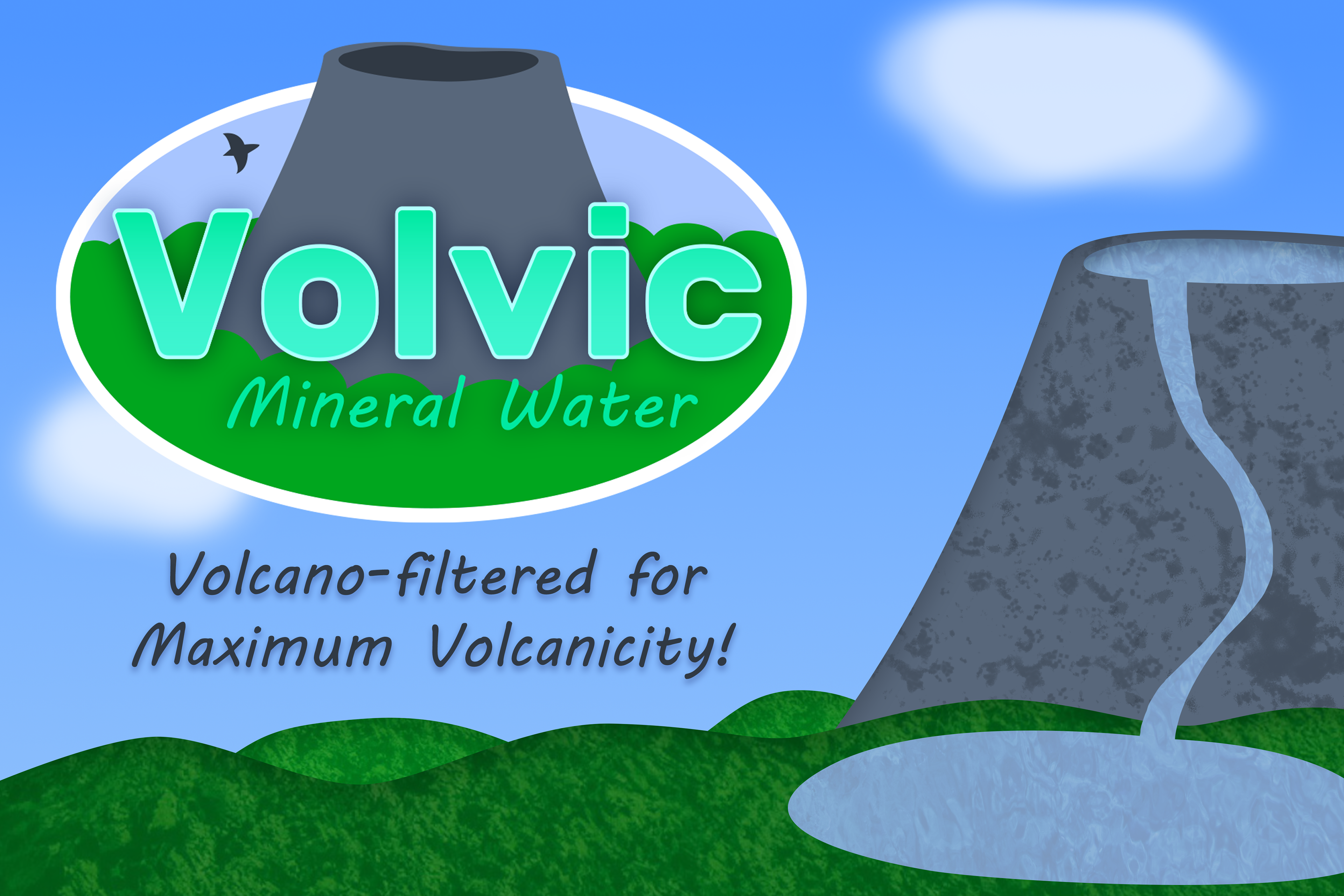
These are some mock-ups I did for a brand redesign project for my Graphic Design II class. One is a bottle label, and the other is an ad on a screen.
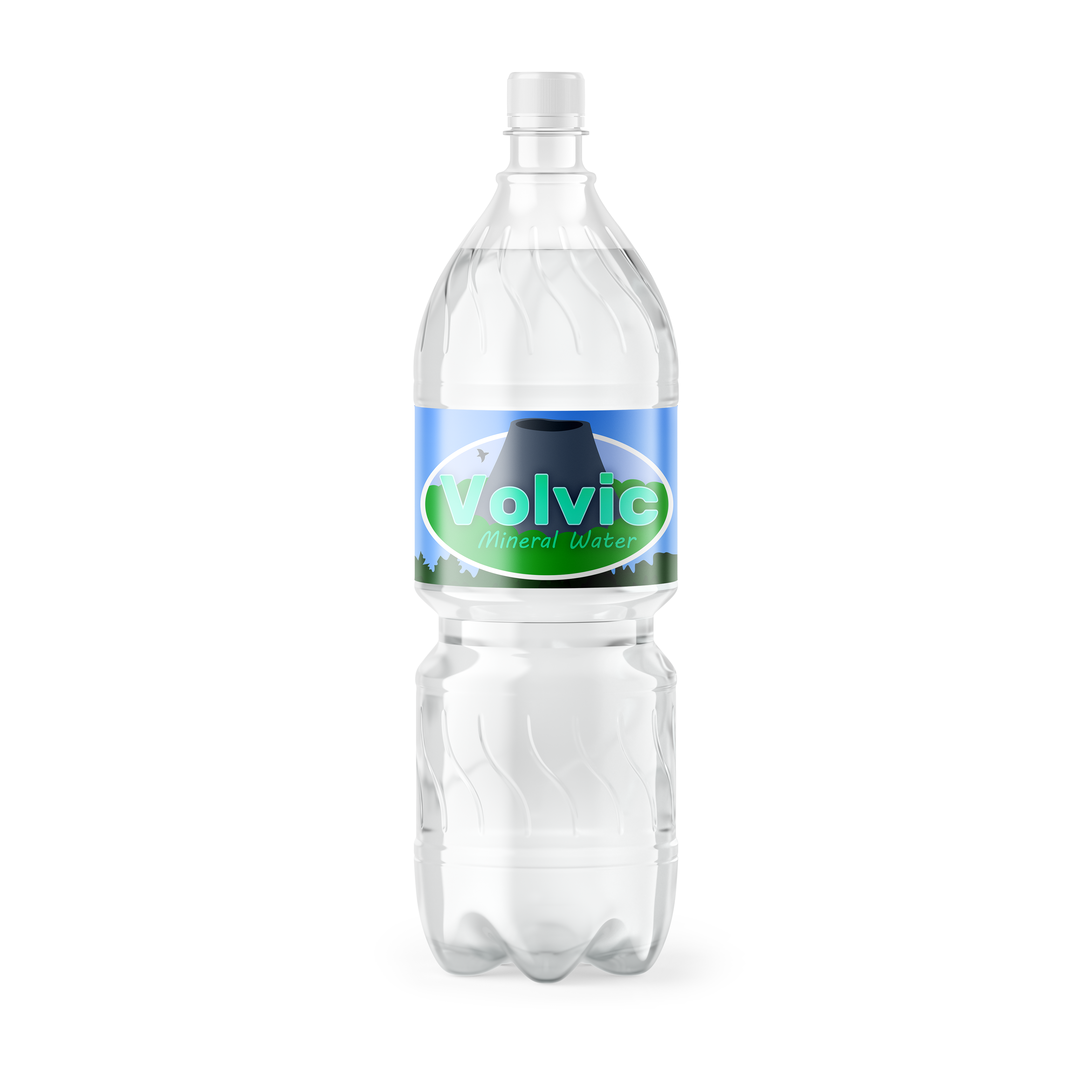
I chose blues and greens because they highlight the natural volcanic sources where Volvic mineral water is harvested. The font of the logo is Rubik Bold, because it kind of looks like it was carved from smooth stone, and the blunted edges give it an approachable appearance.